

Find Physio
As a UI/UX designer, I was asked to redesign the user interface from a mobile app to create a simple, intuitive experience.
Client
Physical wellness company*
A team of physiotherapists who specialise in optimising and restoring physical health with the purpose of improving the user’s physical condition while managing(and improving) muscle and joint conditions
*Client name cannot be mentioned due to NDA
Team
Me - UI/UX designer
Federico Marson - UI/UX designer
Ben Harrison - UI/UX designer
Client - CEO and Founder
Tools
Prototyping - Figma & Sketch
Visual testing - Mural, Google slides & Google forms
Workshops - Miro
Agile Methodology - Trello
Duration
May 24 - June 20
Four one-week agile sprints

Approach
For this project, we applied the Double Diamond design framework. The two diamonds represent a process of exploring an issue more widely or deeply (Divergent thinking) and then taking focused action (Convergent thinking).

Discover
Objectives
For us
Understanding the competitive landscape and user preferences
Redesigning the user interface for the patient’s side
Determining the best visual approach
Providing a fully constructed and documented design system
Providing high-fidelity clickable prototype
For client
Moving long waitlists for face to face appointments for physiotherapists
Making exercise prescriptions - easier to understand and follow
Getting rid of expensive appointments
Understanding the whole product
Whole Product Map
We ran several workshops with our client to engage with him and better understand his expectations and vision.
In this workshop, along with the client we have first analysed the contents in four different circles - Generic(fundamental things that are marketing), Expected(Minimal conditions customers expect from the product, Augmented(aspects of the product that go beyond customer expectations and Potential(what could be done to attract and keep customers.
Once all the information was sorted, we started prioritising the tasks which we have to focus in this project.
This workshop, helped us to get an idea on what we have to do and set the expectations to the client.


Competitive analysis
We conducted competitive research on some of the current market direct(Ascenti, Kaia, Rehab guru, Rehab my patient, Physio and Vita health) and indirect competitors(Six pack in 30 days & My online therapy). Our key findings were:
All direct competitors used a light theme, with white backgrounds and showed images of real people
Indirect competitors used more colour and has a less medical feel
User Interviews
We conducted user interviews on 5 patients, 2 physiotherapists and 2 personal trainers across UK and Australia, to reflect the business’ varied customer locations.
We presented the pre-existing designs for Find Physio, as well as some screens of our competitors, and captured our users’ feedback. The key insights were that users preferred the following:

Clear, minimal design (white/negative space)
Light colours/schemes
Images of real people
Video tutorials
Large images
Well structured plan
Define

Personas
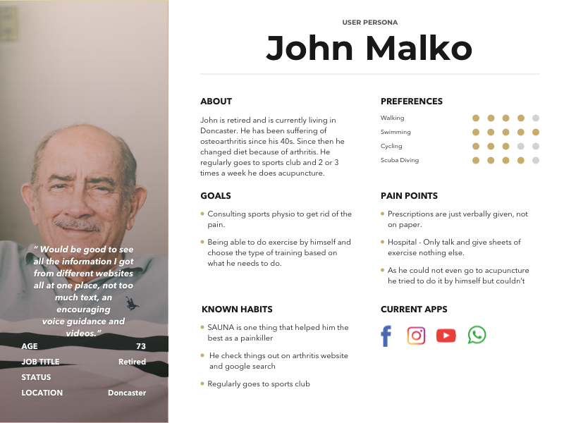
Based on our user interviews we have created 3 different personas to reflect our three identified user groups: a patient persona, a physio persona and a physical trainer persona.
As our client asked us to focus on the exercise prescription feature, we focused primarily on developing screens for patients.
John wants an app where he can watch and perform his exercises and be able to see his progress to keep him motivated.
Design Principles
Keeping our users in mind we as a team developed the following design principles. These served as our team’s reference point to design our screens

Design with the user in mind
Supporting users in improving health and wellness through a simple to use design

Intuitive
Users must be able to complete tasks quickly, without fuss or bother

Minimal & essential information
Simple designs, free of clutter, preventing an overload of information

Iterate
We believe that the best way to build a good product is to start small and iterate constantly.

Original Screens
These screens were provided by our client. Based on our domain research, our key insights are
No proper grid layout
Navigation bar occupied too much space
Icons used are not consistent
Navigation bar is not clearly showing in which page the user is
Instructions are not clearly understandable
Too much negative space in some places

Develop
Generating Design Ideas

Crazy 8’s
This is another fun and productive activity we have done with our client.
What is crazy 8’s? Crazy 8’s is a simple method where you every one in the team have to draw something roughly on a piece of A4 paper folded into 8 rectangles. It is a core Design Sprint method. It is a fast sketching exercise that challenges people to sketch eight distinct ideas in eight minutes.
At the end of each round, we Dot voted individual’s first and second preferences. The most voted ones were selected and then explored further that idea and implement that in our design.

Solutions
Divergent screens
As a team, we have discussed the structure of our screens keeping our research in mind and started designing individually. Below are our 3 different designs

Testing Divergent Ideas
Design Feedback Session
We have tested our designs using miro board where our designs were presented and given different coloured post-it notes for different attributes like
Orange - Spacing margins and padding
Yellow - Typography
Pink - Sizing and visual hierarchy
Purple - Navigation
From the test results and feedback from our client we started converging our designs
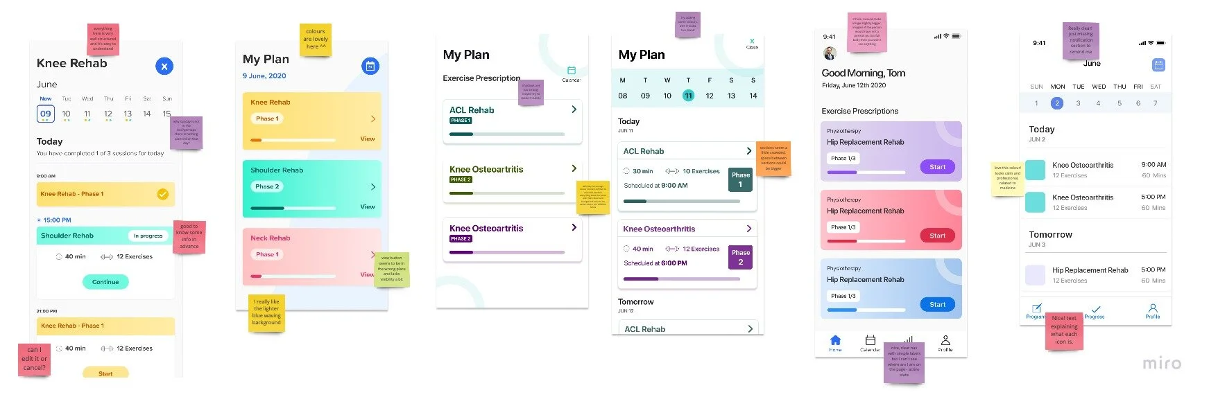

Converging designs
We collaboratively started converging our individual designs into one final product. Here were the key visual elements of our new designs
We have used grids to get consistency in the design
Icons - rounded corners and of same size and stroke
Used brand colour for Icons in navigation bar to highlight the selected page
Users can see all of their exercise prescription plans in one page
To achieve modern look we have used minimal design with proper use of white space


Deliver
High Fidelity Screens


Prototype
Lessons learned
Further scope
Time boxing - It is a helpful method when you have lots of things to do
Agile methodology - helps to organise the things
Design, test & repeat - this is one thing will be very helpful to improve our designs
Communication - express your views even though you think they are stupid and be confident in what you are doing
If I had some more time to work on this project, I would like to work on
Community feature in which our client was interested
Profile page
Tested our final prototype with more people

“Thank you and well done from me. I am super impressed by the amount of work you people have done in short time”
— Client’s thoughts about our work